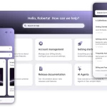
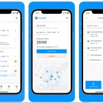
A first impression has been found to increase conversions on the app store by massive 40 percent. Also your app store screenshots take main stage on both app stores and make up important part of this first impression. Of course an interesting image is going to catch attention much faster than text. So it is time to learn about Ways to Improve Your App Store Screenshots.
Moreover mere 3-5 seconds is all it takes to make good first impression. In those few seconds when a visitor comes across your app on the app store they have already made up their mind on app looking good or bad. So actively grasp this great opportunity and make sure your app screenshots raise enough quality to get the user to download.
Here are the top practices when designing your app store screenshots
Actively follow the store screenshot guidelines
Apple and Google have enumerated detailed instructions on what can and cannot be featured on your screenshots. So strictly follow along with the correct requirements. For instance, Android visitors are more likely to decide more quickly whether to download an app or not, compared to iOS global users.
Select order of your screenshots carefully
Order in which your screenshots appear is more vital than you might think. 60% of users won’t even swipe past the first two, so it’s good to make sure these are your top screenshots to capture the attention of your target audience. Your screenshot order must make sense, and even tell a story.
You can highlight the main benefits
An app with numerous features is great, but benefits of features can add to your target users more qualitative. If it is possible to get across your screenshots how your app could actively solve specific problems for your users, then you are onto a major winner. Also you might get a maximum of five screenshots on the Apple store and eight on Google Play. It is your golden opportunity to illustrate why you deserve spot on the users home screen.
You can demonstrate how the app is used
Highlight how straightforward it is can be good trait in the eyes of your target user. So keep the instructions simple and use images that show exactly what to do.
Be descriptive
Also adding text to your screenshots is a strategy. Adding a clear, concise piece of text to a screenshot helps to understand what is going on in the image. You can decide to annotate your screenshots, make sure the text doesn’t over-power the image and must be with correct background, clear to read using the apt colours.
Conclusion
It is said finally that a picture is worth a thousand words, and these images offer you massive opportunity to grab the attention of potential app users and illustrate them why your app is exactly what they have always been searching for.
Also Read App PR Service


